Mastering Excel Charting: 10 Essential Tips for Creating Stunning and Effective Charts
Introduction: The Power of Visual Communication with Excel Charts

Excel charts, visual communication, data visualization, effective communication, and data-driven decision-making.
Visual communication is a powerful tool in today's data-driven world. With the help of Excel charts, complex data sets can be transformed into clear and concise visuals that are easy to understand and interpret.
Excel charts enable effective communication by presenting information in a visually appealing manner. They allow for the quick identification of trends, patterns, and outliers within the data, making it easier for decision-makers to grasp key insights at a glance.
Data visualization through Excel charts also facilitates data-driven decision making. By representing numerical information graphically, it becomes easier to identify correlations and make informed choices based on the patterns observed.
Furthermore, Excel offers a wide range of chart types and customization options that allow users to tailor their visuals to suit their specific needs. Whether it's a simple bar chart or an intricate scatter plot, Excel provides the tools necessary to create impactful visualizations.
In summary, harnessing the power of visual communication with Excel charts enhances effective communication and enables data-driven decision making. By transforming complex data into easily digestible visuals, organizations can unlock valuable insights and drive success in today's competitive landscape.
Tip 1: Choosing the Right Chart Type for Your Data
Choosing the right chart type is essential for effective data visualization in Excel. The decision impacts how well your data is understood and the insights gained. Bar charts are ideal for comparing data sets, while line charts show trends over time. Pie charts are suitable for displaying proportions, and scatter plots reveal relationships between variables. For hierarchical data, consider using treemaps or sunburst charts. Gantt charts work well for project timelines. By analyzing your data's characteristics and your visualization objectives, you can make an informed choice. Selecting the appropriate chart type ensures clarity, simplifies complex data, and helps communicate your message with precision.

Tip 2: Formatting Your Chart to Enhance Readability and Clarity
Chart formatting, enhance readability, enhance clarity, data visualization techniques, visual hierarchy, color coding
In order to effectively communicate your data and insights, it is crucial to pay attention to the formatting of your charts. By employing proper chart formatting techniques, you can significantly enhance the readability and clarity of your visualizations.
One key aspect of chart formatting is establishing a clear visual hierarchy. This involves organizing your data in a way that allows viewers to easily identify and understand the most important information. You can achieve this by utilizing appropriate font sizes and styles for titles and labels, as well as by strategically positioning key elements within the chart.
Color coding is another powerful tool for enhancing chart readability. By assigning different colors to different categories or data points, you can instantly convey relationships or patterns within your data. However, it's important to use color judiciously and ensure that it does not overwhelm or confuse the viewer.
Additionally, employing proper data visualization techniques such as using appropriate chart types (e.g., bar charts for comparisons or line charts for trends) can greatly contribute to clarity. It is also beneficial to provide clear captions or annotations that explain any complex elements or trends within the chart.
By taking these steps in formatting your charts, you can effectively present your data in a visually appealing manner that engages viewers and facilitates their understanding of the information at hand.
Tip 3: Adding Titles and Labels to Provide Context and Explanation
In today's fast-paced digital world, where information is abundant and attention spans are limited, the importance of titles and labels cannot be overstated. These simple yet powerful tools play a crucial role in enhancing understanding and providing context to various forms of content.
Titles act as the first point of contact for readers, grabbing their attention and enticing them to delve deeper into the content. A well-crafted title can pique curiosity, evoke emotions, or convey the main message of an article or blog post. It serves as a guidepost that sets expectations and helps readers decide whether the content is relevant to their needs.
Labels serve as signposts within larger bodies of text or complex systems. They provide concise explanations or categorizations that aid in comprehension. Whether it's labeling sections within a report or categorizing products on an e-commerce website, clear and informative labels help users navigate through information effortlessly.
The importance of providing context cannot be ignored either. Contextual information helps readers understand the purpose and background of a piece of content. It provides clarity by answering questions such as who it is intended for, why it was created, or how it relates to other related topics or concepts.
By incorporating effective titles and labels into our content strategy, we not only enhance understanding but also improve user experience. Readers can quickly identify relevant information without wasting time sifting through irrelevant material. Moreover, clear titles and labels contribute to better search engine optimization (SEO), making our content more discoverable by both humans and machines.
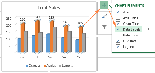
Tip 4: Using Data Labels or Data Tables for Enhanced Data Interpretation
Using data labels or data tables in data visualization enhances data interpretation and comprehension. Data labels directly display specific data points on charts, eliminating the need to refer to axes or legends. This immediate context helps audiences grasp data insights effortlessly. On the other hand, data tables provide a comprehensive view of underlying data, presenting exact values for each data point. These tables facilitate precise analysis and comparison, particularly when dealing with complex datasets. By incorporating data labels or tables in your visualizations, you empower viewers to derive valuable insights quickly and make informed decisions, ultimately maximizing the impact of your data presentations.

Tip 5: Creating Combination Charts to Compare Different Data Sets
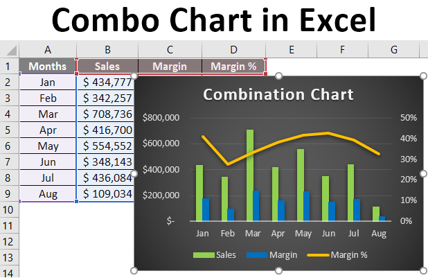
Combination charts are a powerful tool for comparing different data sets in a visually appealing and comprehensive manner. By combining multiple chart types into a single graph, you can effectively present and analyze complex data relationships.
When creating combination charts, it is important to consider the keywords that best represent your data sets. By selecting the appropriate chart types for each set, you can highlight the unique characteristics and trends within your data.
For example, if you have quantitative data that represents sales figures over time and qualitative data that represents customer satisfaction ratings, you may choose to combine a line chart to show the sales trend and a bar chart to display the customer satisfaction ratings side by side.
This combination allows viewers to easily compare and contrast the two datasets, identifying any correlations or discrepancies between them. Furthermore, by utilizing different colors or patterns for each dataset, you can enhance clarity and make it easier for viewers to interpret the information presented.
Tip 7: Customizing Legends and Axes for Better Visualization
Customizing legends and axes is a crucial aspect of data visualization, empowering you to create more impactful and informative charts. By customizing legends, you can provide clear explanations for different data series, enhancing viewer comprehension. Tailoring axes allows you to control the scale, labels, and intervals, making charts more readable and meaningful. Whether it's adjusting font sizes, colors, or positioning, these customization options enable you to highlight key insights effectively. With a well-crafted combination of legends and axes, you can present data in a visually appealing manner, leading to better decision-making and a deeper understanding of your data's significance.
Tip 8: Incorporating Error Bars to Represent Uncertainty in Data
Error bars, uncertainty, data representation, statistical analysis, confidence intervals, variability in data.
Incorporating error bars in data visualization is a crucial aspect of accurately representing uncertainty and variability in scientific research and statistical analysis. Error bars provide a visual representation of the range of possible values around each data point, allowing viewers to understand the level of confidence or uncertainty associated with the results.
By incorporating error bars into graphs and charts, researchers can effectively communicate the inherent variability in their data. These error bars are typically represented as lines or whiskers extending from each data point, indicating the range within which the true value is likely to fall.
One commonly used method for determining error bars is through calculating confidence intervals. These intervals provide a measure of how confident we can be that our sample mean or other summary statistic represents the true population value. By including these confidence intervals as error bars on our graphs, we are able to convey both the central tendency of our data and its associated uncertainty.
Tip 9: Using Chart Templates to Save Time and Maintain Consistency
- Chart templates are a time-saving solution for creating consistent visual representations of data.
- By using chart templates, you can quickly apply predefined styles and formatting to various charts.
- These templates ensure that your charts maintain a uniform look and feel across reports and presentations.
- With a wide range of customizable options, chart templates streamline the process of data visualization.
- Embrace the power of chart templates to enhance efficiency and maintain a professional edge in your data presentations.
Tip 10: Interacting with Charts and Adding Interactive Features
interactive charts, data visualization, user engagement, interactive features, data analysis
In today's data-driven world, the ability to effectively communicate information through interactive charts and visualizations is crucial. Interactive charts not only enhance the visual appeal of data but also provide a way for users to actively engage with the information being presented.
By incorporating interactive features into charts, such as tooltips, filters, and drill-down capabilities, we can empower users to explore and analyze data on their own terms. This level of interactivity allows for a more personalized and immersive experience, making it easier for users to comprehend complex datasets.
Furthermore, interactive charts foster user engagement by encouraging active participation. Users can manipulate variables and parameters within the chart itself, enabling them to gain deeper insights and uncover patterns that may otherwise go unnoticed. This hands-on approach to data analysis promotes a more dynamic and collaborative environment.
From a business perspective, integrating interactive features into charts can significantly enhance decision-making processes. Stakeholders can interact with real-time data updates and perform on-the-fly analysis without relying on static reports or presentations. This not only saves time but also ensures that decisions are based on the most up-to-date information available.
Conclusion:
Excel charting skills, data visualization, data analysis, effective charts, visual representation of data.
Data visualization is not just about creating pretty charts; it's about conveying complex information in a clear and concise manner. With the right techniques and knowledge of Excel's charting capabilities, you can transform raw numbers into compelling visual representations that tell a story and enable better decision-making.
In this section, we will explore how to level up your Excel charting skills to create effective charts that bring your data to life. We will delve into various techniques for selecting the right chart type based on your data analysis goals, customizing charts to enhance their visual appeal, and effectively presenting your findings through clear labels, titles, and annotations.
Whether you are a business analyst looking to present sales trends or a financial professional aiming to showcase budget variances, mastering Excel's charting features will give you an edge in communicating insights with impact. So let's dive in and discover how you can unlock the full potential of Excel as a tool for visualizing your valuable data.
